


Rogue-like
Inventory UI Design
UI/UX Design
This project is a conceptual UI design for a rogue-like game's inventory screen.
A solo project focused on Figma practice and visual style exploration.
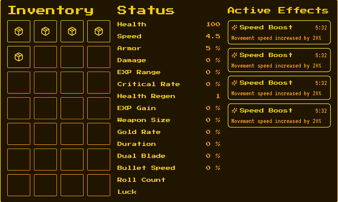
Built as a modern base layout, then restyled into a retro pixel aesthetic to explore how visual identity shapes the identical structure.
Information
Role
UI Designer
Date
09/2025 ~ 12/2025
Tools
Tools: Microsoft Whiteboard, Figma
Project Type & Team
Academic Project, Solo Project, Figma Practice
Location
DigiPen Institute of Technology, Redmond, WA,
United States
Process Overview
- Rogue-like
Inventory UI Design
UI/UX Design
As the sole designer on this project, I designed a conceptual inventory screen for a rogue-like game.
I started by researching inventory UI across the genre, focusing on a single question.
“What does the player look at first, and most often?”
As a result, I made a layout based on player attention rather than on information density.
I structured the screen into three core sections. Inventory, Stat Status, and Active Effects. Anchoring the inventory grid on the left, where the eye naturally lands. I also planned an alternate tab-based layout to compare and support less dense information space, keeping the information architecture consistent across both presentations.
After, I built the base mockup in Figma with a modern, clean visual style. Then I restyled the UI skin into a retro pixel aesthetic inspired by Portal 2's CRT terminals, to observe the difference in feelings between the two visual styles.
Below is a step-by-step breakdown of the
Rogue-like Inventory UI Design.
Work Process


Research & Reference
I started by researching inventory UI across the rogue-like genre to understand what UI elements work and why.
I looked up at titles like Heroes of Hammerwatch, Enter the Gungeon, and Vampire Survivors, along with several other rogue-likes, paying attention to how each game balances three recurring elements. The item grid, player's current stats, and active effects or buffs.
The main question I focused on was, “What does the player look at first, and what do they look at most often?”
Rogue-likes tend to accumulate a large amount of information during a single run. So the UI has to stay readable under that pressure without overwhelming the player.
Layout Design
Before moving into Figma, I planned the screen's overall structure.
I decided to divide the screen into three core sections. Inventory, Stat Status, and Active Effects. Based on prior research, what rogue-like players need to see at a glance.
The inventory grid became the anchor of the layout, placed on the left where the eye naturally lands first. Since that's the section players check most often during a run. Status sits in the middle, with the player scanning occasionally, and Active Effects takes the right side to indicate time-sensitive information without competing for primary focus.
I also planned an alternate tab-based layout for cases where screen space is limited, or the player wants a cleaner view. The idea was to keep the same information architecture but offer two presentation modes. A full three-column view, and a tabbed view that separates Inventory and Effects into their own screens.


Prototyping Mockup
With the layout direction set, I opened Figma and created a mockup in a modern, clean visual style as the base.
I started with the three-column view, building each section as a self-contained module. The inventory grid used a slot layout with consistent spacing. Status entries were laid out in rows, with the stat name on the left and the value on the right, creating a space to prevent info cramming. Active Effects used a thicker row to include the effect name, description, and remaining duration so that the player can read each entry at a glance.
For the tabbed version, I reused the same components, but split the content across two tabs. Inventory and Status, separated Effects. This structure kept the information architecture consistent between both layouts while offering more space and a simple presentation.
Throughout the process, I focused on building reusable components in Figma. Inventory slot cells, status rows, and effect rows. So that I can apply any later style change once and have it propagate across the whole mockup.
Restyling
After finalizing the base mockup, I tried the new style to see how the same layout could carry a completely different visual identity. Shifting from a modern, minimal look into a retro pixel aesthetic inspired by the CRT terminals of Portal 2's end credits.
I changed the visual language entirely, pixel typography replaced the clean sans-serif, brown/yellow replaced blue, and sharp single-width pixel borders replaced the soft rounded containers.
Nonetheless, the underlying structure stayed the same. But the result of feeling was quite surprising. Only the skin changed, but I felt much more “Old” or “Retro” feeling.


